How many subscribers from your city? Where is my audience located? In what city last advertizing campaign was more successful?
Sometimes Business needs to track its presence in particular geography area.
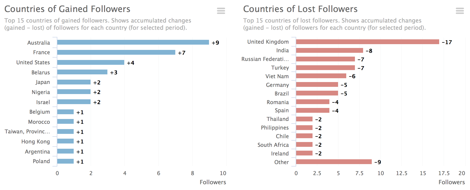
We implemented 4 bar charts that help you understand changes in countries and cities on your followers.
Until recently, 3 graphs were available to you:
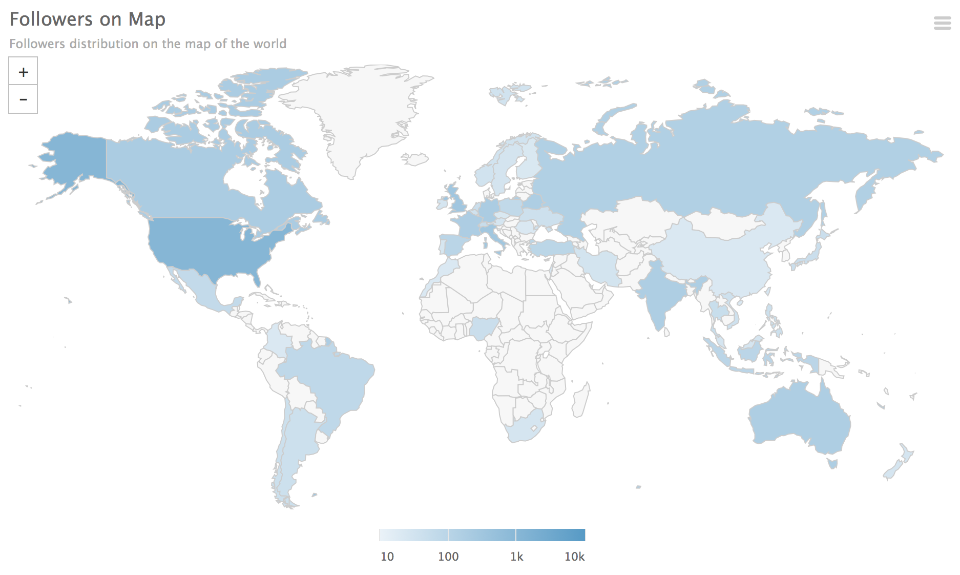
1. Map overview
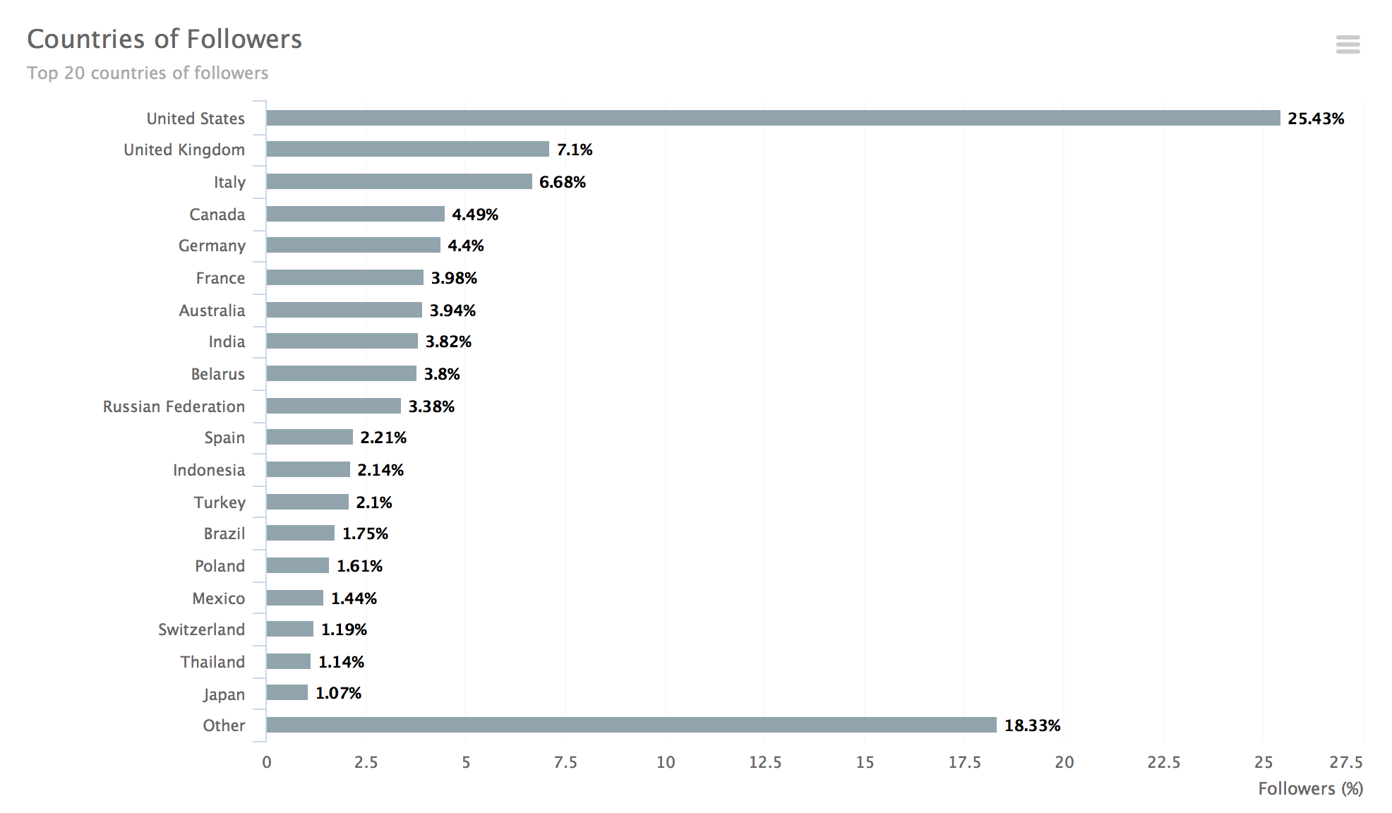
2. Allocation by countries
3. Allocation by cities
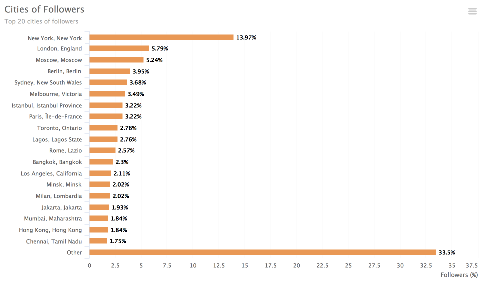
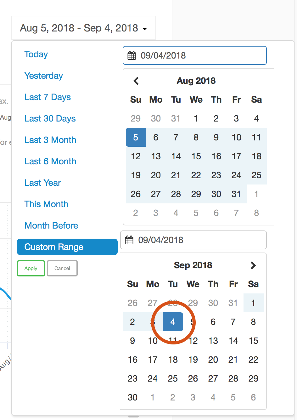
These 3 bar charts always show state for last date in selected period. You are able to select any period and see snapshot of geography distribution for the last date:
This approach is not always convenient since sometimes you need relative data. Here help new graphics.
Changes in countries of followers
Changes in cities of followers
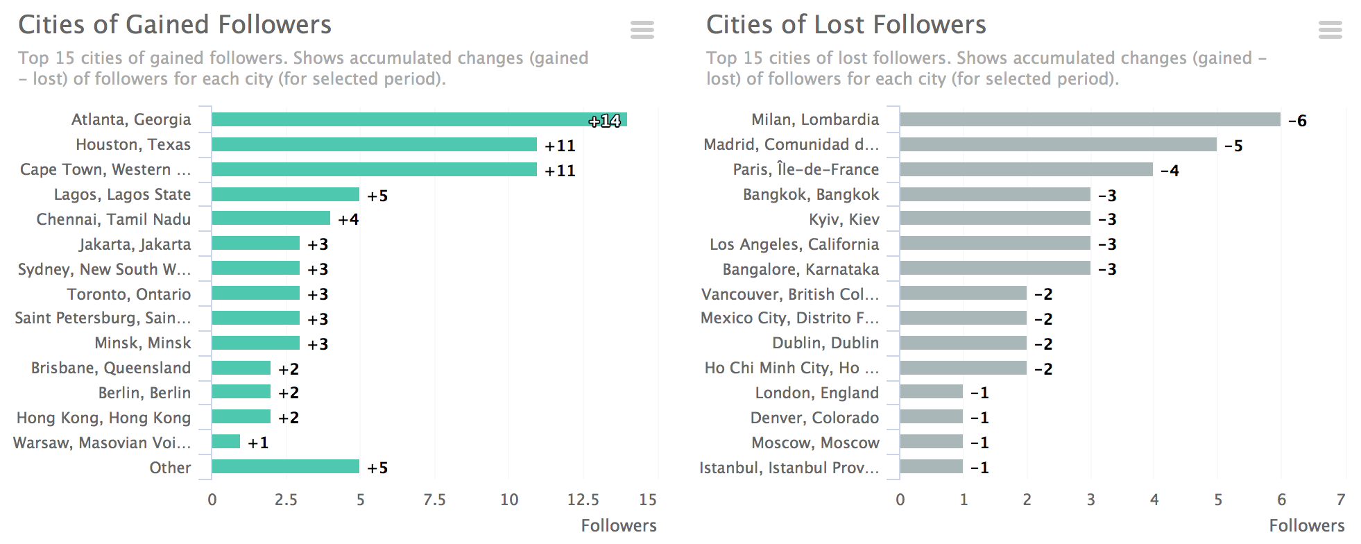
All 4 charts illustrate changes in presence of your Instagram account in displayed countries and cities.
For example, you gained 100 new followers in New York and 100 new Followers in Boston, but lost 200 followers in Chicago. United states will not be displayed in changes by countries graph because your presence in this country still stays the same. However, you will see changes by cities.
We believe new metrics will help you understand your audience better as well as make your account better.
Would you like to get this statistics for your account? Try smartmetrics for free!